
Yellow/Violet Combination
The desired ratio is 1:3.

Red/Green Combination
The desired ratio is 1:1

Orange/Blue Combination
The desired ratio is 1:2
As predicted the combinations were not easy to find and some careful cropping of images was needed to achieve the desired ratio. I found that it was sometimes difficult to judge, on first glance, the actual ratio even approximately. The red/green combination is a case in point. The red of the wheel is centre image and dominates the foreground so that the eye does not travel naturally to the green body of the tractor. The red appears to be the largest colour but in reality the amounts red and green within the image are the same.
My choice of images for colour combinations:
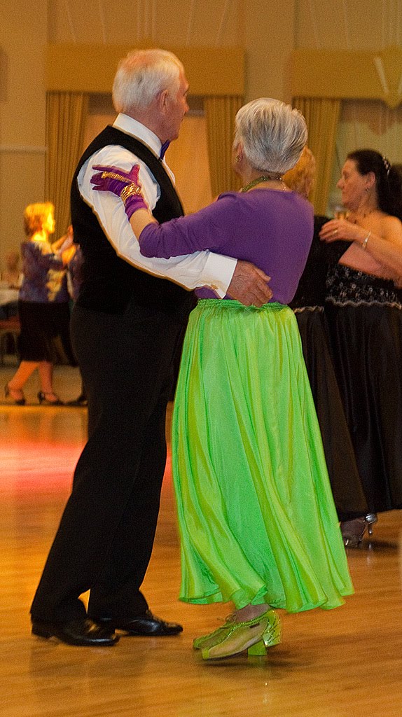
The combination of violet and green in the dress and shoes of the female dancer offers is very striking and perhaps jarring. However it appeals to me because of the context in which I first saw it which was at a Ball. There is also a definite break between the two colours at the waist with the skirt and shoes being green and the bodice and gloves being violet.
The context and our own involvement in the event impacts upon our view of what works and what does not work in a combination of colours. Elsewhere this combination would be described as garish and perhaps unacceptable.

Here we have yellow and red and, although less obvious in the above image, a background of a very dark blue. The designer has used the contrast of the two colours to get across the message. In addition the yellow chosen is part of the brand image cultivated over the years by Colman in their marketing. The red 'isolates' the wording and underlines the reference to meat (red in colour). Why do I like it - because I think it is very striking and works well but also because I am drawn to old metal signs of an era that has now passed.

Here the deep green of the water contrasts with the orange of the surrounding rocks. In one sense this is a natural picture although it has been created by the work of man. The water is the green colour because of the natural leakage of minerals from the surrounding rocks and pollution caused by the use of chemicals to extract those minerals. The orange of the rocks is because of the minerals within the rocks and the lack of vegetation is again because of the use of chemicals in the extraction process. Why do I like it? I find the combination pleasing to look at but, because I know why it is there, also disturbing. It evokes a strong reaction.

This image was taken at dusk and the sea reflects the colour of the sky at the time whilst the colour of the sand is muted by the evening light. I have a liking for muted colours and the suggestion of peace and quiet that they bring. For many others who view this image the combination of colours will suggest the cool of the evening and the approach of night.
No comments:
Post a Comment