Saturday 31 July 2010

Colours into Tones in Black & White

It's a cold wet and miserable day in Suffolk so what better time to do an exercise using still life.

This is the original photograph:


All changes to black and white were done digitally using Photoshop>Adjustments>Black&White.

For the next image I accepted the settings given in the dialog box:


This produced a good range of tones within the image whilst retaining the form and texture of the vegetables.

I then applied the red filter without altering the individual sliders:


As can be seen this produced an image where the highlights are blown out and a lot of the detail is lost.

The blue filter produced this image:


As can be seen virtually all detail is lost.

The yellow filter offered this image:


A similar image to the red filter with blown highlights.

Finally the green filter:


An acceptable image but there is some loss of range of tone.

In this particular example the 'neutral' image produced the best conversion to a black and white image. I spent some time adjusting the individual sliders although I found that it was very much a guessing game as it was not immediately apparent which slider produced the desired result. Combinations of sliders were even more a guessing game.  There are 'plug-ins' available on the internet that produce much better conversions without a lot of trial and error.

I enjoy black and white photography but the subject matter is important as some subjects lend themselves more readily to monochrome. I am not sure that my selected still-life came into this category.


Exercise - Colour Relationships.


Yellow/Violet Combination

The desired ratio is 1:3.


Red/Green Combination

The desired ratio is 1:1


Orange/Blue Combination

The desired ratio is 1:2

As predicted the combinations were not easy to find and some careful cropping of images was needed to achieve the desired ratio. I found that it was sometimes difficult to judge, on first glance, the actual ratio even approximately. The red/green combination is a case in point. The red of the wheel is centre image and dominates the foreground so that the eye does not travel naturally to the green body of the tractor. The red appears to be the largest colour but in reality the amounts red and green within the image are the same.

My choice of images for colour combinations:


The combination of violet and green in the dress and shoes of the female dancer offers is very striking and perhaps jarring. However it appeals to me because of the context in which I first saw it which was at a Ball. There is also a definite break between the two colours at the waist with the skirt and shoes being green and the bodice and gloves being violet.

The context and our own involvement in the event impacts upon our view of what works and what does not work in a combination of colours. Elsewhere this combination would be described as garish and perhaps unacceptable.


Here we have yellow and red and, although less obvious in the above image, a background of a very dark blue.  The designer has used the contrast of the two colours to get across the message. In addition the yellow chosen is part of the brand image cultivated over the years by Colman in their marketing. The red 'isolates' the wording and underlines the reference to meat (red in colour). Why do I like it - because I think it is very striking and works well but also because I am drawn to old metal signs of an era that has now passed.


Here the deep green of the water contrasts with the orange of the surrounding rocks. In one sense this is a natural picture although it has been created by the work of man. The water is the green colour because of the natural leakage of minerals from the surrounding rocks and pollution caused by the use of chemicals to extract those minerals. The orange of the rocks is because of the minerals within the rocks and the lack of vegetation is again because of the use of chemicals in the extraction process. Why do I like it? I find the combination pleasing to look at but, because I know why it is there, also disturbing. It evokes a strong reaction.


This image was taken at dusk and the sea reflects the colour of the sky at the time whilst the colour of the sand is muted by the evening light.  I have a liking  for muted colours and the suggestion of peace and quiet that they bring. For many others who view this image the combination of colours will suggest the cool of the evening and the approach of night.


RPS Eastern Region Exhibition.

Spent yesterday help hang the exhibition that is on at Mundesley Norfolk from 31st July -14th August. My main function was that of providing manual labour but this did give me the opportunity to observe how the images were arranged on the display boards.

Each panel held four images and there were two panels to each board. The boards were arranged so that the viewer was offered four, eight, sixteen or 32 images within one 'area'. Our Regional Organiser Joy Hancock FRPS was the sole arbiter (this is the only way to stand any chance of finishing the process and it being coherent - imagine a dozen people offering their opinions or placing images where they thought best. (Democracy doesn't always work!).

Joy's main aim was to achieve 'balance' within each area not only in subject matter but also how the colours in the images harmonised. It was fascinating to watch as she placed and replaced images as different ones came out of the box. There were approximately 136 images so it was not possible to display them before the placing happened. In addition you want to draw the visitor into the display so that there was a need for the initial impact to be strong enough for them to want to see more.

In terms of the part of the Course I am presently studying it was a very useful day as different sets of pictures emerged, were changed and re-formed elsewhere. Gradually a definite pattern emerged and the changes became less although there were a very small number of images that did not quite comfortably fit anywhere. Sometimes it was the subject matter or the photographers approach that in some way made them unique within  the overall exhibition or the colours within the image did not sit happily with others.

I had an opportunity to go around the exhibition and try to work out why the panels were as they were. It made me thing about the panel as a whole, the individual images and elements within the image that worked together to produce the desired balance.

Monday 26 July 2010

Project: Primary and secondary colours

Previous blogs set out the process I followed to reach this point. Essentially I tried to establish what colours were actually within the wheel in the Course material. I think I understand what a person means when they say 'red' or any of the other primary and secondary colours. However experience has taught me that whilst I am generally in agreement with others this is only true in very broad terms. I am not colour blind but whether a red is more to the orange end or the violet end of the reds is much more open to discussion. Furthermore the light in which the colour is seen affects our perception (the 'red' sweater that looked so good in the Store looks a lot less acceptable in the daylight).

Although we are asked to find scenes or parts of scenes that are dominated by a single one of the primary and secondary colours I found this very difficult. For example I could take a photograph of a green bush, a yellow flower or a violet flower although on first glance they appeared to be the colour stated there was a range of colours within the picture that could be called 'green' for example.


Closer viewing will show that there are a range of greens as one would expect. Similarly with a violet flower or a yellow flower.  

I seemed to come across this range of colours with all natural plants. However I did manage to find one example in the natural world of a dominant green that was very close to the desired green.
The middle image is the first exposure and the one above +.5 of a stop. The other is -.5 of a stop. The large leaf to the right of the image in the first exposure gives the closest match to the colour wheel.

For the red I photographed part of a tapestry that is predominantly red:


The middle file is the first exposure with the +.5 being at the top and the -.5 being the bottom image. The area of red to the bottom left corner of the image created by the lowest exposure level is the closest to the colour wheel in the Course material. There are other 'reds' within the picture some of which appear to have more than a hint of orange.  

For the yellow images I found that I had to rely upon a man made colour albeit a dye rather than paint (is there a difference?)


The first exposure is shown in the middle with the +.5 at the top and -.5 at the bottom. On balance the exposure taken at -0.5 of a stop gives the closest match to the colour wheel.

The 'blue' image is also a man made colour dye:


The placement of the images is the same as in the two above. In this case the nearest match lies in the exposure +.5 (the bottom image).

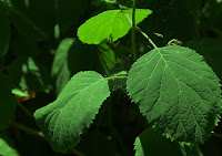
I was fortunate to find a green leaf that at normal exposure gave a close match to the green of the colour wheel. 


Again the same placement applies. There is very little difference in the three images if one looks at the large leaf on the right of the picture (this leaf is the closest match in all three images).. The closest match in my opinion is that shown in the middle image.

There were plenty of orange flowers but I was unable to find one where the colour was consistent across a the flower. I therefore tried the more obvious approach of photographing the fruit "orange". I came across this bowl of oranges whilst visiting the kitchen of a former stately home:


The blue surround is the bowl in which the fruit was placed. The closest match is in the last image (+.5 of a stop) being the orange in the foreground.

Violet that was a close match to the colour circle was more difficult to find. In the natural world the plants that appeared violet were often more dominantly blue when photographed. In the man made world of colour the best I could come up with was the painted side of a child's toy in a playground.


The last of the three patches offers the best match. I readily acknowledge that this is akin to photographing a paint manufacturers catalogue.

I took a long time over this project, gave it a great deal of thought and took a large number of photographs. So what did I learn?  In one sense not a great deal. I was already aware of the vast range of colours and the primaries and their complements, although based on the RGB of photography rather than the painters circle used in this exercise. Looking for the specific colours heightened this awareness and strengthened my knowledge of the effect of ambient light and the impact of different exposure levels. 

As always the benefits gained from doing all this work are not likely to be immediately evident in my work. 


RPS Eastern Region Exhibition Selection

I spent yesterday at the above event. Members submit prints and digitally projected images (dpi) for selection by 5 judges (all members of the RPS). Yesterday there were 68 members who submitted 4 prints each and 28 who submitted 4 dpi each. One of the four (print and dpi)  go through from each member but the remainder are in competition with all other submissions. The standard was very high as would be expected.

It is the third time I have been but this time rather than sitting there disagreeing with the judges' decisions I looked at the images applying what I have learnt from the Course so far. Composition was a key element in the successful images particularly in ensuring that the image was seen as a whole.  The use of light in the morning or evening scored highly, more so where it gave a sense of depth to the image. Colours were generally muted and only a handful of images had strong colours. I had little chance of assessing whether the correct ratio of colours was a key element as this requires an analysis that is impossible in the very brief period of time that each image was on view.

I will get another chance to see all the successful entries as I am helping man the exhibition on a couple of days during the two weeks that it is being held in August. It will be interesting to take the opportunity of a more leisured look at the images to see if my first impressions are supported by closer examination.

Whilst this analytical approach is a great learning experience there is a danger of missing the whole picture that actually makes an image successful or produces a positive response from the viewer. Having been present at a large number of exhibitions and competitions where there has been an individual judge who expresses an opinion before awarding a mark I am certain that the mark is awarded almost on first sight of the image. Whilst closer examination may reveal technical flaws that may lead to a reduction in the mark generally we react to an image and then try to explain why (rationalising the irrational).

Overall it was a very valuable day and made me more aware of the elements of an image and hopefully will enable me to incorporate these elements into my own images.

Sunday 25 July 2010

Busy few days

Had a busy few days in the past week.

 From a photographic point of view last Wednesday went with some friends to Banham Zoo in Norfolk. "Wildlife" is one of my least favourite subjects as I feel no connection at all with the animals. I have never taken an interest and therefore have little awareness of their behaviour patterns making getting the great photograph pure chance even in captive conditions. Banham Zoo is a great believer in heavy wire mesh, with one or two exceptions, making even getting a photograph difficult. Having said that it was a good day out and I did manage to get a handful of passable images and resolving the problems of the cages and the environment made me more aware of the workings of the camera.

Friday I went to London where Joe McNally from Kelby Training was holding an all day seminar on 'Location Lighting Techniques'. A really great day and I learnt a lot. Currently I have a Speedlite 580EX flash that I have only ever used on camera. I had some awareness of the value of bouncing the flash but totally lost on how, or why, it interacted with the camera.  At least now I have the information to make some progress in using it, particularly off camera. I am not sure that I would ever be tempted into the world of stands and multi-units with the vast range of diffusers but who knows! Certainly the whole range of possibilities was demonstrated. Perhaps the key lesson that I came away with was 'try the set up out' starting simple and moving in incremental steps to the more complex and "stick with it". Don't become discouraged. Joe McNally's strength is tenacity (his words not mine).

From a Course point of viewI used the Banham visit to work up my knowledge and understanding of colours. I hope to post my colour wheel in the next few days (seems to have taken for ever) and follow up with the next exercises in a reasonable period of time.

Had fun with my printer. It suddenly decided to start printing an unusual range of colours that were nothing like the screen. I worked out that it was not printing photo black at all. The cartridge was shown as very low but not empty. I changed the cartridge and tried again- no difference! I have only had the printer a couple of months so I thought long and hard and came up with the idea of a nozzle check (the blindingly obvious!). Found the manual on line (oh for the days that the manual came with the printer) and worked out how to do the check. Bingo - photo black was not printing. Something called a power clean carried out and success. Lesson - start from the simple (seemed to have heard that somewhere before).

Sunday 18 July 2010

Photographic Alliance of Great Britain Competition.

I attended the PAGB Digital Projected Image National competition at Warwick Arts Centre (a superb facility on the campus of Warwick University) yesterday. It was an all day event involving 37 clubs from around the UK and the showing of over 600 projected images. The standard, as one would expect, was exceptionally high and the range sufficient to appeal to everyone there.

From a personal point of view the opportunity to see so many excellent images was one not to be missed. Inevitably, given where I am at on the Course, I found myself analysing the images for lines and shapes and the use of colour. Having read ahead I also looked at how the photographer had used light. Examples abounded and my newly earned knowledge added to my appreciation of the work before me. For those images that did not readily lend themselves to such analysis it was worthwhile to work out why they were successful.

At another level it was interesting to compare my judgement of what the images were worth in terms of a score to the marks actually awarded. My opinion was affected by the reaction of the audience around me to the image being shown (?a desire to conform with the general view or perhaps the opposite) and very much my own personal tastes. As would be expected a 'theme' of what was likely to score well in the judges eyes evolved fairly quickly in the first round (it was wildlife closely followed by nudity) and equally what was not going to do well. This was confirmed in later rounds.

I have found over the past few years that there are definable trends in what is seen as 'good' and 'not so good' in photography. To take one example landscapes rarely do well in competition or exhibitions at the moment although there is some glimmer of hope that they are making a comeback. 'Record' shots i.e. a photograph of something that is simply there, is too often seen as not being worthy of the skilled photographer even when the image is powerful in it's own right.

Off my soapbox!!  What did I get from the day? The primary lesson was about the use of light within a photograph either to emphasise the subject or to induce a sense of 'mood' in the viewer. From the soft gentle light of an early dawn in Tuscany (the place must be crowded with photographers) to the harsh glare of a stage spotlight nearly all the images displayed an awareness of the use of light to achieve the objective.  As a secondary to this was the awareness that soft light needed pastel colours to be successful whilst harsh or strong light worked well with strong colours.

Composition seemed to be a given and of the hundreds of images seen only a handful seemed to be unsuccessful in this area.

I never fail to come away from such events without an increased awareness of what is achievable and more importantly how it can be achieved.

Tuesday 13 July 2010

Colour Wheel 2

The review of the material I collected at Blickling Hall demonstrated that in nature finding a 'pure' colour is almost impossible. All flowers/plants that I was able to find were never just one colour even in a relatively small area and were usually a combination of a range of the same colour. For example whilst we may describe a flower as 'orange' or 'yellow' closer viewing revealed that there was a whole range of shades in between the two. I was fortunate in finding a leaf that had consistent colour across its surface although shifting light did change this to a certain extent.

Although I am still looking it seems almost inevitable that most objects I photograph will be of man-made colours either through paint or dyes.  Although I have examples of a variety of materials there is no escaping the fact that, apart from the case of the leaf, they are all the product of man.

At the time of writing I am still searching but the project has reached the stage where I feel that I am gaining very little for a great deal of effort.

Saturday 10 July 2010

Colour Wheel

Having, hopefully, taken sufficient images to have a reasonable chance of creating a colour wheel I was concerned about trying to compare the image on the screen with the colour wheel in the Course material. Printed colours are reflected light off the page whilst what we see on the screen is transmitted light making comparison difficult.

Initially I thought of scanning the page into Photoshop and whilst this seemed to provide a satisfactory result I could not be sure that the scanner did not have a built in colour bias. I gave the problem further thought and decided that I would photograph the page with a gretagmacbeth colorchecker adjacent to it and in the picture. I was then able to use the eyedroppers in Curves to test the appropriate colour patches on the chart and adjust the image. The result produced an accurate image (colour wise) of the printed colour wheel.

To make as sure as I could be I carried out the same process but this time used a swatch card that had a patch "camera raw white balance". Comparison of the two results showed that they were very close to each other in terms of the colours.

Satisfied that the image that I had obtained was accurate I then used the Eyedropper tool in Photoshop to sample the individual colours using a 101 x 101 pixel average. ( the usual 3 x 3 or 5 x 5 pixel average gave some differences as I moved the tool over the colour image). I noted the RGB values in the Info palette and then created individual colour patches using these values.

Okay that was the technical bit now all I have to do is carry out the comparisons.

I may be gone some time!

Tuesday 6 July 2010

Colour Circle

Having been discouraged from taking pictures of doors to complete this project, and as I felt that staring at nail varnish and lipsticks was likely lead to some awkward explanations to the store staff, I decided to try cultivated plants as they offer a very wide range of colours.  I did realise that very few, if any, would be displaying the colours required but at least I thought it would be a start.

I knew from previous visits that Blickling Hall, a National Trust property in Norfolk, has very good gardens and indeed I was not disappointed. At the time of writing I have yet to sort out the colours I photographed and see their proximity to the primary and secondary colours but I feel that there was potential so watch this space!

Then good fortune shone upon me. I turned into the walled garden and there in front of me were four waste bins in four different colours, red, green, blue and purple. Sometimes you get really lucky when out pursuing photography and that day was one of those days.

However still got plenty of time to complete the project and the more I have thought about things the more ideas have formed. It certainly has made me think about colours in a different way.

Thursday 1 July 2010

What makes a Colour - Control the strength of a colour

All the images in this section were taken at a shutter speed of 1/125 and an ISO rating of 250. All were shot as JPEG's to avoid any changes automatically applied when transferring a RAW image to Photoshop.
Readings were taken at the same spot in each image of  Hue(H), Saturation(S) and Brightness(B) and Red(R), Green(G) and Blue(B). The readings are provided after each image

The first image was taken at f11


H 228; S 2; B 88.    R 223; G 224; B 228.

The second at f14


H 230;  S 3;  B 75.  R184; G 183; B 189.

The third at f16 (this image is taken at the exposure as established using the camera's built in exposure meter.


H 266; S 4; B 67.  R 165; G 166; B 171.

The fourth at f20


H 240; S 4; B 58.  R 140; G 141;  B 146.

The fifth at f22


H 220; S 3; B 38.  R 94; G 98; B 99.

From the readings of the RGB scale the colour is largely 'neutral' and remains so throughout the changes in exposure. As one would expect the brightness(B) readings show a smaller number as the exposure decreases.