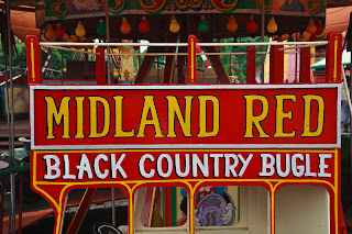
The black and white version was created using the Adjustment Black and White layer in Photoshop without amendment:
Using this black and white as the baseline the next image has been created using the High Contrast Blue filter that is a preset available in the Black and White adjustment layer dialogue box (settings were Blue, Cyan and Magenta shifted to 150% and Red, Yellow and Green shifted to -50%):
Reverting to the original black and white image the High Contrast Red filter preset was used (settings Red and Yellow shifted to 120%, Green-10%, Cyan, Blue, Magenta -50%):
The Blue filter created a very dark image with only the original white lettering and paint work clearly visible. The Red filter produced a light image that seems a little washed out and lacking in contrast but is better than the Blue filter.
I experimented with a whole series of settings to see the different effects. Some were acceptable although in all honesty it seemed to be a lot of work for uncertain results. Maybe the image chosen was not the best for the exercise.


No comments:
Post a Comment