Friday, 27 August 2010

The lighting angle

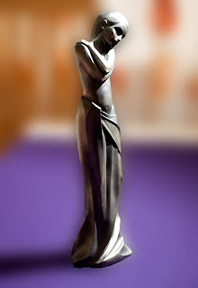
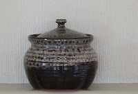
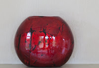
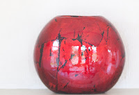
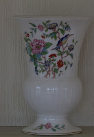
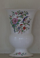
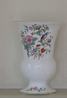
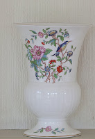
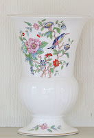
The camera was set at the same level as the subject of the photograph attached to a tripod and fired by remote control. Aperture value was used and set at f2.8 to limit the depth of field. A flash was used off camera using TTL. All images were shot in RAW and the same level of enhancement applied to all in the Camera RAW conversion software.


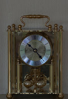
In this image the flash is in front of the image and at the same level.


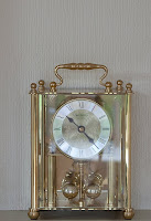
In this image the flash is to the side of the image.


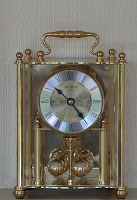
In this image the flash is behind and to the side of the image at approx. 45deg.


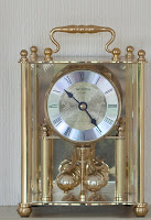
In this image the flash is immediately behind the image as can be seen! I could not work out how to avoid this result with the equipment and space available One thought that occurred was using a soft box of sufficient size to appear as a 'white' screen.


The flash has now been raised above the subject and the shot taken from the front.


In this image the flash still above the subject has been moved to the side.


The flash still above the image has now been moved behind and to the side of the image at approx. 45deg.


The flash still above the image is now behind the image.


The flash is now directly over the image.


In this image the flash is above but slightly in front of the image.


The final shot is with the flash over the subject but this time slightly behind.

In this set of images the ones giving the greatest sense of the three dimensional nature of the subject are those taken from the front with the camera and light at the same level as the subject. Those taken where the flash has been moved to the side but still at the same level also give a sense of form.

My preference is the second image taken from the side and with camera and light at the same level. The amount of detail  is good and for me there is the greatest sense of a 3 dimensional image.

A very useful exercise that made me think about the positioning of light and the value of being able to move the source off camera to achieve the desired effect. I took many more photographs than those shown partly to familiarise myself with the use of the flash and moving it off camera but also to make minor changes to the position to assess what effect they had upon the result.

Exercise - Softening the light


In common with most of August today was damp, cold, miserable and overcast suggesting that it was a good day for staying indoors. I decided that I would give my recent purchase of flash attachments a try out.

I am not keen on studio photography although my only experience is two sessions at different photographic clubs sessions where equipment was provided by members. In both cases there was a 'professional' studio set up with synchronised lights and various backdrops along with a variety of reflectors and diffusers. In one case we had willing models whilst in the other members acted as 'volunteers'. Unfortunately there was insufficient time to for individuals to create their own lighting and of course flash was going off all over the place. Probably not the best introduction.

I decided that initially I would keep the equipment to a reasonable cost so I purchased a Viewfinder Accessories kit that fitted my Canon Speedlite 580EX that had been given to me as a present 5 or 6 years ago and only used a couple of times. I had been given a demonstration of how it worked at a local Warehouse Express and had been impressed. I also purchased a Lastolite 3 metre cable so that I could use the flash off camera. To support the flash off camera a used a Manfrotto 682B monopod that has three small legs that means that it can stand on its own.

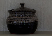
The first image was taken with the flash pointing down at the subject without a diffuser with the camera also slightly above the level of the subject.


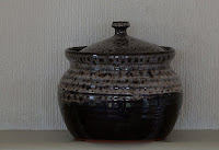
The second image was taken in the same way but this time a diffuser was fitted to the flash.


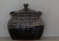
The noticeable difference between the two images is in the highlights. The second image has softer less harsh highlights giving a more realistic appearance to the 'clothing' . The head and shoulders in the first image are over exposed and there is loss of detail.

Of the two images I prefer the second because of the better tonal range and the greater subtlety of the lighting.


Monday, 23 August 2010

Half way through the Course

I have now completed approximately half of the Course "The Art of Photography" and thought it an appropriate time to assess what I have gained.

At a general level I am more aware of the nuances of photography at the basic level. When explaining to friends and colleagues why I embarked on the Course I tell them that, in common with many others, I picked up photography as I went along with very little idea why some things worked and other things didn't. The only problem with this is that you are not in a position to analyse your mistakes and avoid them in future or indeed to repeat your successes. A 'back to basics' approach has made me think more about what I am doing. Certainly I am more aware of the facilities available on the camera, what to look for when composing an image in the viewfinder and why some times I am successful.

At the specific level part one of the Course 'The Frame' was largely reinforcement of my level of knowledge at that time. Elements of design was an eye-opener and made me view things in a different way. Colour was useful and will probably be more so as I progress through the whole degree course. I am only just beginning to wrestle with light but a quick glance through the notes suggests that here is something I have a lot to learn about having taken it for granted in the past.

The one thing left to do is to slow down and stop taking umpteen photographs of one subject just because I have found a good example. I need to think more about what it is I want to achieve and to think about the wider context in which the subject matter exists.

Saturday, 21 August 2010

Higher and Lower Sensitivity

All the following images were taken on Market day in Bury St Edmunds. As can be seen it was an overcast day but even so I had to set the aperture at f20 so that I could achieve the range of shutter speeds desired. There was no enhancement of the images in Photoshop.


ISO 100 Shutter speed 1/10. Blurred image partly because of movement  but also because I am unable to hand hold a camera sufficiently still at such a slow shutter speed. I had decided not to use a tripod because of the problems of being amongst a lot of people intent on shopping. The effect of camera shake is evident in the sign "Tom's Snacks".


ISO 200 Shutter speed 1/13. I would have expected a higher shutter speed for the increase in ISO. Presumably the level of light changed or I had pointed the camera at a darker part of the image. Image suffers from the same problems as the one shot at an ISO of 100.


ISO 400 Shutter speed 1/30. There is quite an improvement in the quality of this image which given the slow shutter speed surprised me. Still some blurring from movement.


ISO 800 Shutter speed 1/40. Again not the shutter speed increase that I had anticipated but there is a noticeable difference in the overall sharpness of the image.


ISO1600 Shutter speed 1/160. I increased the shutter speed to this level to ensure a shutter speed that was in excess of the level I need to hand hold the camera. The image is acceptably sharp and there is no movement. 

I moved my position in the market for the next set of images to change the overall light level.


ISO 100 Shutter speed 1/10. Comparing this image with the first one of the previous set there is a noticeable difference in the level of sharpness. Although it is not of an acceptable level it was much better than I would normally expect.


ISO 200 Shutter speed 1/30. The increase in ISO produced a faster shutter speed as one would expect.Quite a good image that could be 'rescued' in Photoshop.


ISO 400 Shutter speed 1/60. Again an acceptable image. This is probably due to being able to brace myself against a wall to take the image.


ISO 800 Shutter speed 1/160.  The image is sharp and the problems caused by camera shake have been eliminated.

Again I moved my position to change the light levels within the scene:


ISO 100 Shutter speed 1/13. All the problems faced in the first two sets at this shutter speed are apparent.  The images were taken  'free standing' with the usual market crowds bustling around so there was a certain amount of grabbing the image as the opportunity arose.


ISO 200 Shutter speed 1/25 Camera shake is the main problem (see the Post Office sign)although the movement of people in the frame is also a problem.


ISO 400 Shutter speed 1/60. This image is really a ?good example of why one should use a tripod. It was snatched in order to avoid a number of people who were about to cross the frame.


ISO 800 Shutter speed 1/125 The shutter speed is about the minimum at which I can be reasonably confident of an acceptable result.

For most of my recent photographic career I have been very conscious of the problems I face with camera shake. Whenever possible I use a tripod or a monopod but as in this shoot it is not always practicable or is specifically barred as is often the case in churches or other buildings. I therefore often resort to increasing the ISO where reducing the aperture value would not produce the desired end.

The recommendation in the handbook for my camera for overcast skies is an ISO of 400 - 800 and this is born out by this exercise. However where the depth of field is critical or where even at f2.8 the shutter speed is low I will increase the ISO to 1600 or greater ( the most I have used was the equivalent of 12800). I have found that noise in most circumstances is not a problem even at a level of 1600. I base my decision on whether I want to have the photograph or not and if the answer is that I do then I will put up with the noise.


Sunday, 15 August 2010

Light - Measuring exposures

I felt the important thing to achieve first was to prevent the camera from compensating for under/over exposure by altering the shutter speed or aperture depending upon which of the two I had set. Setting the camera to manual was the answer (so find the instruction manual and read what it says)! Having sorted that out I then felt that there needed to be a consistency of ambient light to ensure that there was a common baseline for each exposure. I therefore decided to take the shots indoors.

In order to achieve a range of options for altering the aperture I set the shutter speed at 1/6. Of necessity I used a tripod and also a remote shutter release to eliminate shake.

First part of the exercise. I found the instruction ambiguous. I understood the part about making them darker or lighter than 'average' assuming that 'average' referred to the exposure set by the camera's evaluation system. The 'why' seemed to be less obvious as the short answer was because the shot had been taken at a higher or lower exposure level but I thought something more was required although I know not what.
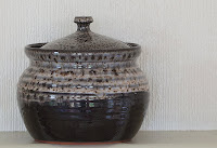
The following five images were those taken


Exposure level as set by camera (spot evaluation)


Exposure level + 0.5 stop


Exposure level + 1 stop


Exposure level - 0.5 stop


Exposure level - 1 stop

The differences in exposure were achieved by a constant shutter speed and altering the aperture to achieve the desired end. In each case I checked the exposure level indicator in the LCD on the back of the camera to ensure that the change was the required one.

Part 2 of the assignment.

The set up described above remained in place and only the object being photographed was changed. It will be seen that I included shiny objects as I wanted to see if there was any benefit in reducing the exposure levels to reduce the impact of any glare or specular highlights.


 The images are in the order from darkest to brightest with the third one in the sequence being the exposure 'set' by the camera. my own preference is for the image that is half a stop lighter as there is more detail in the body of the object and there is a more satisfactory difference between the object and the background.


 The images are in the same order as all following images will be. Here we have a shiny object and as can be seen there is very little difference in the reflections over the different exposures. Of the five taken my personal preference is the average exposure.


In this case my preference lies marginally with the +0.5 stop. The problem here is that the decoration on the vase is better defined in the -0.5 stop image but the remainder of the vase is two grey. I believe this is an example where there is no ideal exposure solution and the best image would be produced by combining the elements of at least two of the images or dodging and burning.


 Another shiny object and the average exposure reveals all the problems of photographing a shiny objects particularly where it also has a glass front that acts almost as a mirror. For me the best image is the -0.5 of a stop because most of the reflection and specular problems are dealt with. This could also be said of the + 0.5 of a stop image although there is slightly less detail overall.


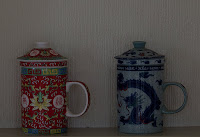
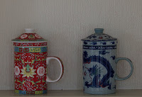
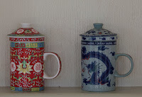
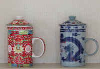
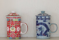
 My preferred image is the +0.5 of a stop. Although the average image produces the closest match to the actual colours of the tea mugs the slightly higher exposure offers an overall better image.

Overall lessons - I found this a very useful and rewarding exercise. Although from previous exercises and general photographic knowledge I felt that I knew about the effects of different levels of exposure I added to my overall knowledge. Perhaps more importantly it made me think how I could effect more control over the camera. I generally use aperture value and leave the camera to set the shutter value to achieve the best exposure. I have used bracketed exposure but only where I was planning to use High Dynamic Range software.
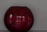
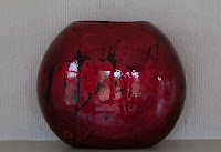
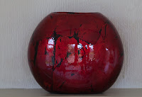
The experiment in shiny surfaces (I know this comes up later in this part of the Course) was inconclusive. In the images of the clock it worked well but there was less benefit in the shots of the vase.